Four months.
Nearly 100 emails.
Countless hours of brainstorming, research and writing.
Those are just a few of the stats that went into building, rebranding and launching the new JessicaLawlor.com in early October.
Many of you have asked me about selecting and working with a web designer, brainstorming and building a blog and planning for the launch of a website, so I thought it might be useful to outline the entire process from start to finish.
It was a lengthy process (and therefore this a lengthy blog post), but I wanted to do this website right. I’m extremely proud of the outcome and excited to share with you how it all happened…
Rewind
Back in March, after faithfully maintaining a book review blog for more than two years, I decided to call it quits. I took a hiatus from blogging for six months, but during that time I was brainstorming, working with a web designer and scheming the launch of the new JessicaLawlor.com.
A Message From The Future
I had always planned on redesigning my site, but in early June my friend and I randomly decided to see a psychic while we were in Baltimore before the Gavin DeGraw concert. During my five-minute cheapie session (she was a psychic in a mall, after all) she said to me, “Is there a project you’ve been wanting to pursue?” I tentatively answered, “Yes” immediately thinking of my blog and freelance business. She then said, “You need to pursue it. Now. Devote time to it. It will make you very successful.” Of course, this could have been a complete coincidence, and I’m sure she could say that to anyone about any kind of project, but it still gave me the little kick I needed to get the process moving.
Selecting a Web Designer
While I’ve been a blogger for nearly five years, I understand that my strength is in writing, and not in creative web design. When I decided to rebrand and relaunch my website, I knew that I needed to hire a web designer who completely understood my vision and would be patient enough to make sure it was done right.
I put the call out on Twitter letting my followers know that I was seeking recommendations for a web designer. I received many recommendations that I researched and followed up on, but one person stood above the rest- and came highly recommended by five other bloggers I respect and admire.
That web designer was Ashley from Little Leaf Photography & Design. After browsing her website and impressive portfolio, I was sold. I loved that the sites she designed were professional, yet fun (something I really strived for throughout the entire creative process) and reflected the personalities of the bloggers behind the site. I was most inspired by this website that Ashley designed and often referred to it in conversations throughout the design process.
The Creative Process Begins
I reached out to Ashley in early June to express my interest in working with her. In my initial email I filled out a simple form letting Ashley know my overall goals for redesigning my blog, ideal start and finish date and my approximate budget. Ashley let me know that she had an opening in her design schedule for mid-July. Perfect! My goal was to have the site up and running by early fall.
From there, Ashley and I discussed budget. I won’t reveal exactly how much I paid for my rebranding and site launch, but I will say that Ashley’s rates are reasonable for the amazing work she produces. Her prices range based on individual client needs. If you’re interested in working with her or learning more about her rates, I recommend that you contact her.
After I officially signed on the dotted (email) line, we were off and running! I filled out a more detailed form outlining my ideas for taglines, navigation, logos, email marketing, three sites I loved and three sites I hated. Filling out this form took me more time than I’d like to admit, but I knew that this was the most important part of the whole process. This was the part where I communicated my vision to Ashley and I knew I needed to be clear and have an understanding of exactly what I wanted to ensure I got what I wanted.
Selecting a Tagline
Selecting a tagline was perhaps the most difficult part of the entire website design process. Your website header and tagline are often the first thing someone sees when they click onto a site and I wanted my tagline to really reflect my blog so that people would stick around to check out the content.
I toyed with the idea of doing something straightforward (but a little boring) with just my name and a tagline of “PR-Social Media-Writing” but quickly nixed the idea. The services I offer are important but they do not reflect me or my blog, as a whole.
After I nixed that idea, I thought about going with a quote. I’ve always loved quotes, so it only seemed natural to select one that resonates with me. I struggled with choosing between the two below quotes:
“Life Begins at the End of Your Comfort Zone”
“If Your Dreams Don’t Scare You, They Aren’t Big Enough”
I love both quotes, but ultimately went with my gut; the first choice. It was the original quote I loved and the one that most accurately described my new journey; trying new things, escaping my comfort zone and getting gutsy.
Designs
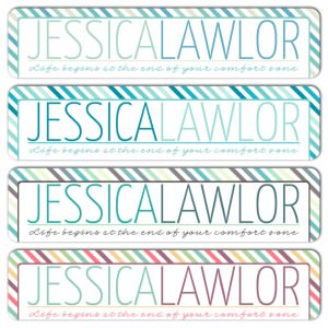
After providing Ashley all kinds of design information, she sent me the first round of designs- four potential headers to work off of and give feedback on.
When I received these first designs, the first one immediately stuck out. I loved the boldness of my name and the eye-catching stripes around the border of the site. However, I knew that those weren’t the colors I wanted. They were a little too bright and don’t reflect my personality. I told Ashley that I wasn’t 100 percent sure that ANY of those designs were THE ONE, but that I’d like to see the first design in more muted and toned down colors.
From there, Ashley sent me a link to this color palette website (click if you dare…you may get sucked into this site for hours like I did!). I selected the palettes I liked and Ashley sent me several more designs.
Obviously, I ultimately chose the third option! The colors were exactly right: feminine (but not too feminine!), professional, fun, creative and reflective of my personality.
Once I selected the palette, Ashley began to build out the rest of the site; I sent her my headshot, social media links, text for top navigation links and Mailchimp information to create an e-newsletter call out box.
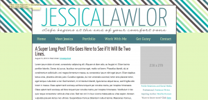
She sent me a screenshot of the site, as she had designed it so far; not quite right. I disliked the stripes at the top and really disliked the yellow background. After seeing so many versions of just the header with the beautiful stripes all the way around, I admitted to Ashley that I was surprised that the site didn’t look the way I wanted. I should have known to be patient though; it often takes several rounds of design and editing to get exactly what you want. Ashley was amazing and completely patient with me and assured me that we would get the site to exactly where I wanted to be. Back to the drawing board.
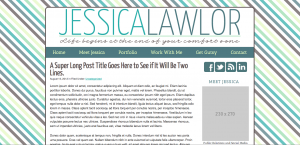
The next version she sent me was closer, but still not perfect.
Holy stripes! I loved the elements of stripes in my header, but looking at this version of the site just made me a little bit dizzy. This version was much closer to what I wanted, but I knew we still had a ways to go until it was just right.
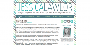
After many emails back and forth, I was finally able to clearly explain to Ashley my vision. A few days later, she sent me this:
I replied to the email with this design with, “YES, YES, YES! This is exactly what I want!” Ashley had nailed it.
Preparing for Launch
After we completed the design, it was time to install the site! I sent Ashley my WordPress login info and after a tiny (MAJOR) snafu (my site apparently got hacked and the file was corrupted…lesson learned: even if you aren’t actively blogging, login to WordPress every once in awhile and do your updates), the site was live.
Ashley installed the site on a Sunday and I went live on that Tuesday. I scrambled the entire day Sunday and Monday night to finalize the content for each of the main pages on my site, as well as writing my very first post! I had my sister and friends read and edit the main pages multiple times making sure every word was perfect and clearly communicated my vision and goal for the blog. It was an overwhelming, but fun few days as I prepared to finally share the project I had been working on for months with the world.
Launch Day
Launch day was so exciting! To promote the launch of the site, I shared the news on Facebook, multiple times on Twitter, through my Instagram account and on Pinterest. Many of my friends and Twitter followers retweeted and shared the news, as well. On the day of launch, I began getting email notifications letting me know that people were signing up for my e-newsletter list (exciting!) and I enjoyed a day of great traffic on the site. It was so fun to hear feedback on the site and see my friends and followers excitement that I was back to blogging.
A Bright Blogging Future Ahead
Now more than a month after the launch of this blog, I couldn’t be happier with my site and the direction it’s going in. I absolutely love having an outlet to write about whatever I want under the umbrella of getting gutsy and living a life that makes me happy. I love being able to share YOUR stories and look forward to doing more of that in the months ahead. I love being able to share resources and great blog posts each week to help inspire you and move toward your goals.
Have you ever built and launched a website or blog? Share your experiences in the comments below!



I think you chose the best layout ;-). I’m still in the process of thinking over what I want, exactly. I do have my wordpress account, with a few posts (unpublished) but I want to create a nice layout and fix my own URL as well. Still trying to find out which way to go in writing themes. Currently, I am using blogger more often, but I’m not quite satisfied, also my topics greatly vary so no real target group. What did you do to promote traffic? I do get nice comments every now and then, but only few people share on their FB page or Twitter… Any thoughts? Thanks, Robin
Thank you! I think so too 🙂
In regards to getting traffic and comments, honestly, I just promote my posts on Twitter (and FB sometimes when applicable). I’m less concerned with traffic though and more interested in creating great content. Growing a blog can be slow going, but strong content is key and will last forever.
I also have blogged for a few years now, so I have some loyal readers and commenters who have stuck around throughout the years 🙂
Commenting on other blogs is also a great way to drive traffic back to your site!
Hope this helped, Robin!
Very cool to get this behind-the-scenes peek! I’ve been thinking about redesigning my site for a while, but I’ve been nervous to take the plunge. I appreciate your recommendations and information, and I’ll definitely be popping back over here down the road!
DO IT! If you want to talk it out, let me know! It’s a time consuming, but fun project! I love that my site really reflects who I am.
I haven’t updated my blog design in years, which is a little ridiculous. I have ideas for how I want to change it, yet part of me still wants to do it myself. Which may be way it hasn’t happened yet. Eventually though…. and I do love your current, and thought it was fun reading how it happened. I especially loved how you shared all the different header designs!
Haha, I knew there was NO way I could do it myself. I just have zero design skills and not even patience or time to do it the way I would want to. It was much more worth it to hire a professional 🙂 If you have the skills though, then you should definitely go for it!
Glad you liked the post! I love behind the scenes peeks, so I figured everyone else would too!
Pingback: Recent Designs.
Pingback: Niche Blogging vs. General Blogging: Which Helps to Grow Your Blog?