Right around this time last year, I started a major project — one I’d put off for months (OK, I’ll be honest: years).
That project? A rebrand and redesign of my website and blog, JessicaLawlor.com.
I knew the project would be quite the undertaking (and a major investment in my business), hence the reason why I pushed it to the back burner time and time again. But ultimately, I knew it was time to bring JessicaLawlor.com into 2019 and beyond.
Curious what it takes to redesign a website and blog + how much it actually costs? Read on for a behind-the-scenes look at the process of redesigning my website.
Why JessicaLawlor.com needed a rebrand
When I launched JessicaLawlor.com nearly seven years ago now, the site was simply a blog.
Over the years, it shifted and eventually turned into the digital home for the communications agency I formed three years ago, Jessica Lawlor & Company (JL&Co).
However, in looking at my former website, upon first glance, you wouldn’t know that.
You’d see an outdated-looking blog and a several years old photo on my sidebar. If you stumbled upon my site and never clicked on the “work with me” tab in the main navigation, you probably wouldn’t have known I had a business.
My goal for the redesign was to make it abundantly clear that I’m first and foremost a business owner WITH a blog, not a blogger with a business.
Choosing the right strategic partner
The first step in any redesign/rebrand is to get the right team in place.
As I set out to find a website designer, it was important for me to:
- Work with someone who understood both small businesses and blogging i.e. I don’t really want to work with a big design agency
- Support a fellow female-owned business, if possible
I started the search for my perfect fit of a web designer in October 2017. Yep, 2017 — a long time ago! I began my research by crowdsourcing recommendations on Twitter and Instagram. I dropped each recommendation into a Google spreadsheet where I outlined their services, pricing and my first impressions upon browsing through their online portfolios.
Confession: Then from November-April, I completely ignored the list. Oops.
In April 2018, I recommitted to the project with this blog post and dusted off my trusty spreadsheet. At the same time, one of my business besties Brittney Lynn saw my blog post and emailed me recommending a client of hers, a designer based in Brazil.
I added Brittney’s recommendation — Michaela Latavanha of Beachside Studio to my spreadsheet.
At that point, I narrowed down my search to Michaela and one other designer. After a website strategy session with Michaela, I was sold, but still scared to officially sign on the dotted line.
I thought about it for two more weeks, and eventually realized it was now or never. I signed my contract with Michaela in July, and we prepared for an August start date.
In total, I considered 12 different design shops with rates ranging from $500-$9,000. Something I didn’t expect to run into during my search was having to eliminate several designers simply because they only work on Squarespace sites. I knew I was sticking with WordPress, so that helped me narrow down the list.
Kicking off the project
When our August start date arrived, Michaela, my team member Rachel and I were off and running.
I was immediately impressed by Michaela. She sent me a sweet welcome present in the mail and set me up with a very organized client portal/Asana calendar where I could easily keep track of all my “homework” and deadlines. She made the process seamless.
First things first, I had to get to work! Michaela assigned me some homework ahead of our two-hour strategy session.
My homework included:
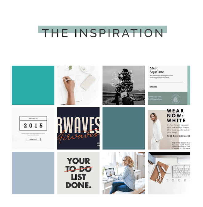
- Creating a Pinterest inspiration/mood board
- Filling out a detailed website questionnaire and content questionnaire
- Sending login information and passwords to Michaela
I took the homework very seriously — I knew it would help Michaela truly understand my vision for the new site. I also landed on three words that described my future website and brand: Bold, clean and inspiring
After submitting my homework, Michaela and I had a two-hour strategy session where she asked me some really tough questions about my business, how clients find me and how I earn money.
This is when I knew Michaela was the real deal — she was SO much more than a designer. She was a true strategic partner who cared about designing a site that would actually convert visitors into clients, not just one that looked good. (Which, ahem, it totally does.)
After the strategy call, Michaela sent me a strategy document that included the look and feel of the site, a site map, a persona of my ideal client and my ideal blog reader, and a buyer’s journey guide for my site. Michaela also included a wireframe of my future website. See image below.
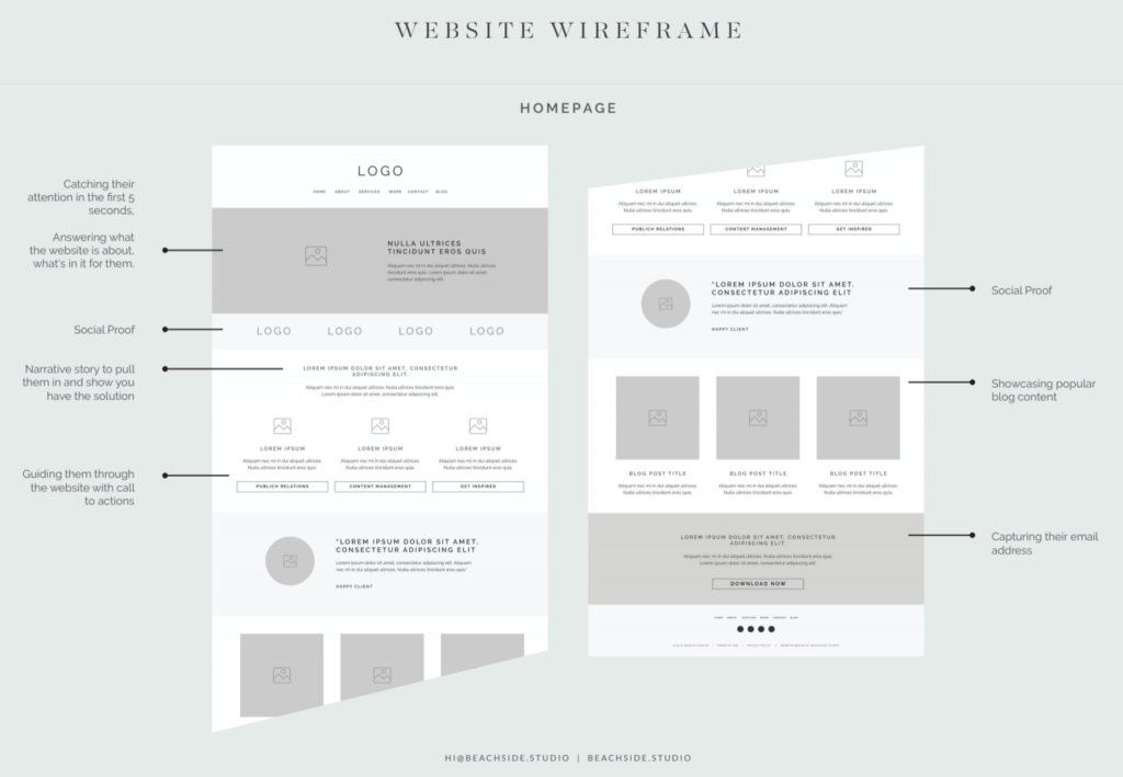
At this point in the process, I had a clear idea of what the site might look like, which was helpful for what was coming next: content!
The part of the project that nearly killed me: Content
OK, here’s the thing. I am a writer. It’s literally my job. It’s what my clients pay me to do.
However, writing my own website copy was the single hardest task I’ve completed since starting my business.
From the start, this simply felt like the most daunting part of the project.
My team member Rachel and I got started in Michaela’s website content workbook she sent our way answering questions and prompts like:
- Describe the style and tone of voice you want for your business.
- Describe the experience of working with you. What atmosphere do you want to create?
- Think about the problems that bring your ideal client to you and your business. Describe those problems, including how your ideal client feels when facing them.
These questions helped immensely when filling out my actual website content document Michaela sent my way.
I won’t lie though — the content took me a VERY long time to complete. (Ugh, I’m shuddering just thinking back to the experience.)
I had to write copy for several pages of my site, including my home page, about page, contact page, work with me page and several core services pages (content management, public relations, public speaking).
Rachel and I divided and conquered the content, but at the end of the day, the site is in my name, and it needed my attention to ensure it read in my voice.
When I submitted my website content document to Michaela in early September, it turned out to be nearly 40 pages long. WOW.
Part of the content process also included images, of course! I sent over folders full of images for Michaela to choose from, including some from my brand photoshoot, client logos, publication logos and more.
And then the site was back in Michaela’s hands to get designing!
The fun stuff: Design
Here’s where the project got fun, and I started to be able to see the light at the end of a long tunnel.
Michaela started sending me mockups of the design.
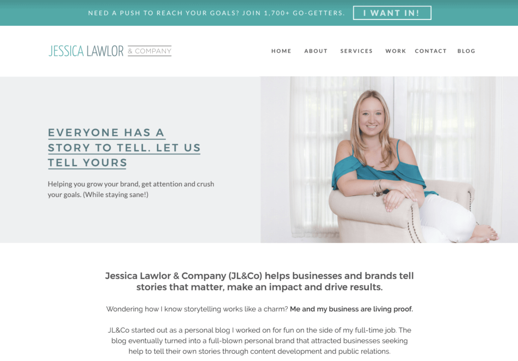
She started by sending a mockup of the homepage along with a video of her explaining the choices she made. Here’s what the very first homepage mockup looked like. Not very far off from what you see today!
Michaela continued sending me other pages to review. With each page she sent, Rachel and I would collaborate on sharing our edits with Michaela in a Google document.
One of the challenges in reviewing mockups is that it’s difficult to understand the flow of the site when you can’t click. It’s a very static experience, so keep that in mine.
By early October, I’d approved all page mockups, and Michaela was ready to send me the live website to review. It was at this point in the process we worked through dozens of nitpicky edits and requests (i.e. make this font bigger, this link doesn’t work, swap this logo with that one, does this photo look weird?)
I was anxious, but knew we were so close to launch.
Time to launch!
After months of work, it was finally time to share my new site with the world.
Michaela did all the tech-y stuff to officially make the switch, and on the second week of November, my new site was live.
However! I didn’t share it right away.
The site went live on a Monday, and that morning I sent a sneak peek of the site to a handful of trusted friends/colleagues who I knew would test the site and give me honest feedback. This was an important step in the process because after staring at the site for months, I knew it needed some fresh eyes before launching it publicly.
On Thursday, I announced the site on social media and sent out a newsletter to my audience.
Michaela helped me with the launch too! She created some awesome promotional graphics for me to share on social media.
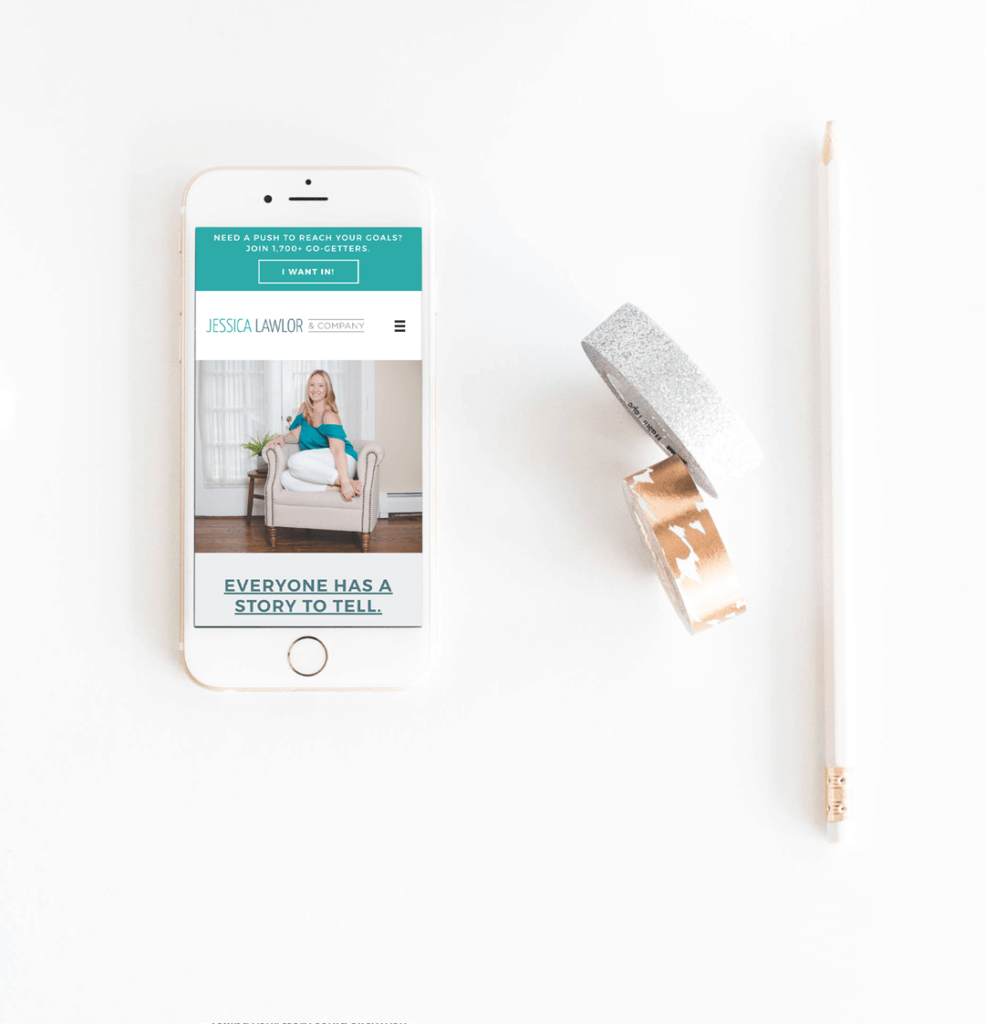
The reactions to the new site were more than I could have hoped for!
I saved the feedback in an email because it makes me smile and reminds me that all the hard work was worth it. Here’s some of what I heard:
“It looks so so great!!! Definitely a major upgrade. Photos are great and go with the color scheme. It’s also a lot more clear from the homepage what you do.”
“Jess! I LOVE the new site! It is so fresh and clean and very much you. It’s so easy to navigate and find information about the many, many hats you wear. The colors are just gorgeous and I love the font you use. Plus the pictures are so perfect and complimentary to the copy and your brand. It looks so professional and modern. I just can’t tell you enough how amazing it is!”
“ITS SOOO GOOOOD!!! I love it. I love how clear it is what you do and have to offer. And I love that it still feels like “you” and isn’t too much of a re-brand :)”
“It’s so easy to navigate and it tells all about your business, but still has that very comfortable vibe that’s super accessible. I love it!”
How much did it cost?
Here’s what you’re probably wondering: How much did this whole thing cost?
I will say this upfront: It was an investment — one that I planned and saved for — and one that has already paid itself back in new client work.
The total cost of the redesign was $7,000.
*Note that packages are created individually based on what you choose to include. My package included quite a lot.
It’s working!
During launch week, this website already did its job!
A newsletter subscriber who has been on my list for some time but wasn’t totally familiar with my services clicked over to the site after I shared the link. She reached out because she needed assistance developing a PR plan for a new nonprofit she was helping to launch. That email (and my new site) led to a $2,000 project literally within days of the site going live.
Since then, the site continues to work hard for me, driving new leads and allowing me to reach potential new clients.
I no longer cringe when someone tells me they found me via my website. Instead, I feel happy. and proud.
Before and After
Ready for your own redesign?
If you’re considering a redesign of your own, I hope this guide helped you understand the steps , work and soul-searching involved in the process.
To be honest, the project was just as daunting as I expected it to be, but I am so glad I took the leap to get it done.
Looking for a website designer? I highly recommend Michaela of Beachside Studio. You can reach her on her contact page here. (Be sure to tell her I sent you!)
And P.S. Michaela didn’t pay me to write this post or offer any sort of discount. I truly give her glowing reviews like this to every single person I can. She was the best partner I could have asked for in this process.


 Roundup of articles about content
 Resources/tools for creating, managing & marketing content
 Content job/gig opportunities